UI/UX law
// Perception & Gestalt;
60-30-10 Rule
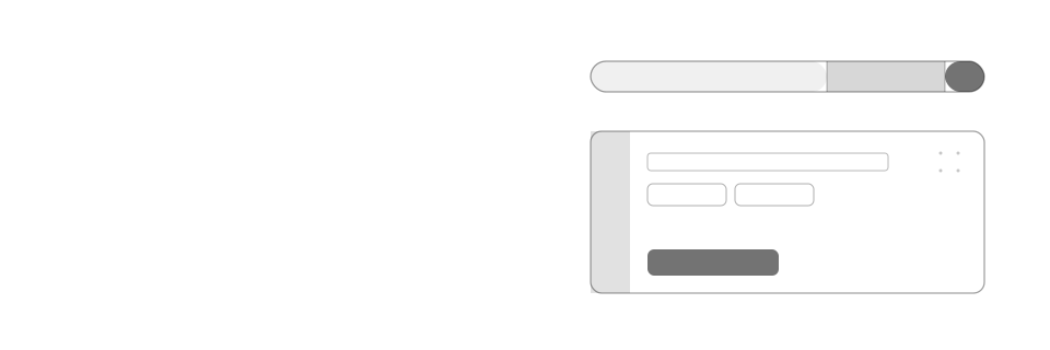
Split a screen's colour into three roles by proportion: roughly 60% a single neutral for backgrounds and most surfaces, 30% a muted secondary tone for supporting panels and structure, and only 10% a single saturated accent, reserved for the one action or state that should win the eye's first pass.
Mechanism
Why it happens
Saturated colour is a scarce attention resource, not a decoration. The eye's pre-attentive system flags the most colourful, highest-contrast region of a screen before anyone reads a single label. Give five different regions five different saturated colours and that system has five equally loud candidates to choose from, so it scans the whole screen instead of landing anywhere in particular.
The 60/30/10 ratio, borrowed from interior design, fixes this by rationing colour the way scarcity always works: a large neutral base (roughly 60%) gives the eye somewhere to rest, a muted secondary tone (roughly 30%) defines structure without competing for attention, and a single saturated accent (roughly 10%) is spent on the one thing that should win. Because that accent appears nowhere else, it inherits the same distinctiveness advantage as the Von Restorff effect: it stands out precisely because everything around it agreed to stay quiet.
Impact
Why it matters
- Colour is a finite attention budget: spend it evenly across every button, badge, and panel and none of them read as more important than the rest
- A UI with one dosed accent reads as considered and expensive; the same palette spread evenly across every element reads as loud, and ironically, cheaper
- The ratio is a proportion, not a pixel count: it's a discipline for how many surfaces are allowed to carry saturated colour at once, not a rule to measure with a colour picker
Example
Without vs. with
A dashboard fills its sidebar with solid purple, its banner with solid blue, and gives "Sync" a green button and "Export" an orange one, so "Upgrade," in yet another saturated colour, carries no more visual weight than the four colours already competing around it.
The same dashboard keeps the sidebar, banner, and progress track in one neutral and one muted secondary tone, styles "Sync" and "Export" as quiet outlined buttons, and reserves the one saturated accent for "Upgrade," the single action meant to get clicked.
Checklist
How to apply it
Pick one neutral for roughly 60% of the surface: backgrounds, page chrome, and most containers
Pick one muted secondary tone for roughly 30%: panels, secondary buttons, dividers, and structural surfaces that shouldn't compete with the primary action
Reserve a single saturated accent for the remaining ~10%: the one primary CTA, or the state that most needs to be seen right now
Before adding a new saturated colour to a screen, ask what it's displacing from the accent's 10% budget; if the answer is "nothing," it's probably diluting the ratio, not adding to it
Recipe
Code example
Where it shows up