UI/UX law
// Perception & Gestalt;
Responsive Table Restructuring
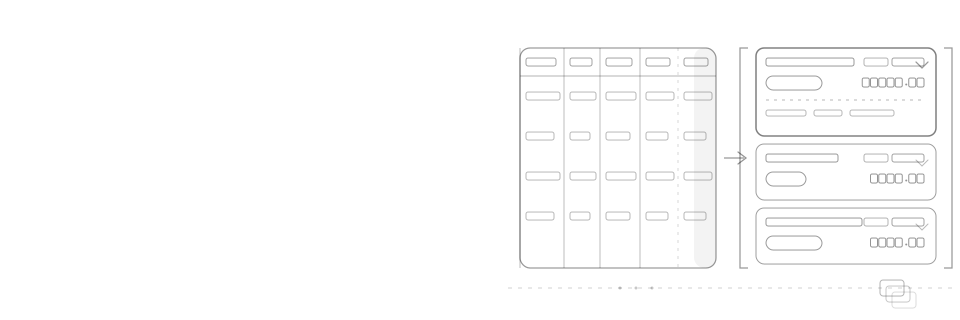
A data table doesn't reflow at a narrow size, it restructures: columns are ranked by what people actually use, the row becomes a stacked block with each ranked field anchored to a fixed slot, a label is added only to values that are ambiguous without their column header, lower-ranked fields move behind a disclosure onto the fuller record instead of disappearing, and the whole switch is driven by the table's own container width, not the viewport's.
Mechanism
Why it happens
A table's columns are a horizontal layout by construction, one row of headers governing every row beneath it, so a table has exactly two options once it no longer fits: shrink every column until the content is unreadable, or let the row scroll sideways until the columns run off the edge of the screen. Neither actually solves the narrow case; both just relocate the failure. Restructuring the row into a stacked block sidesteps the constraint instead of fighting it: a block has no horizontal limit, so a row that used to force five columns into 320px becomes a card that stacks the same fields top to bottom with room to breathe.
Stacking only works if it's ranked first. Fields displayed with equal weight in a vertical stack take as much scanning effort as columns squeezed sideways, so the fields that justify a permanent line in the stack (typically an identity, a value, and a state, mirroring what a table's leftmost and rightmost columns usually already carry) have to be decided before the layout changes, not discovered by whatever happens to fit. Everything that doesn't make that cut isn't gone, it's demoted to a disclosure, which is the same distinction Law of Deletion draws between removing a requirement and simply not giving it permanent screen space.
A stacked block only reads as fast as the column it replaced if a repeated value still lands in the same place row to row. The trap is layout that flows: an amount placed immediately after a status pill inherits whatever x-position that pill's own text happens to end at, so 'Paid' and 'Overdue', different lengths, push the amount beside them to two different starting points, and an eye that used to scan straight down a column of dollar figures now has to hunt sideways for it on every row. Anchoring the amount to a fixed slot instead, the end of a two-column layout rather than the end of whatever text precedes it, restores that alignment: every amount lands at the same edge regardless of what its neighbour says, and font-variant-numeric: tabular-nums keeps the digits themselves the same width on top of that.
Labelling and self-evidence pull in opposite directions, and only some fields actually need the label a lost column header used to provide. A bare date carries no unit of its own: 'Feb 27' could be an issue date, a due date, or a last-activity date, and only the header it lost by stacking used to say which, so it needs a label restored inline. A dollar amount already contains its own explanation in its formatting: the currency symbol and the fixed decimals say 'this is money' the same way no matter which column it came from, so prefixing it with 'Amount:' repeats what the format already gives for free. Labelling every value on principle, rather than only the ones that lose meaning without their header, buries the one label that's load-bearing under several that aren't.
The disclosure a stacked row expands into doesn't have to stop at restoring the columns that were ranked out. Because it opens in place under the row that triggered it rather than routing to a new page, it can surface the fuller record behind that row, issue date, plan, seat count, owner, even fields the table never gave a column to at all, the same way a spreadsheet's frozen summary differs from the full record behind it. What keeps it a disclosure and not a page is that visual continuity: it opens and collapses against the exact row that owns it, so the person never loses their place the way a route change to a new URL would cost them.
None of this should be driven by the viewport. A table embedded in a dashboard's right rail is narrow on a 1440px monitor, and the same table given the full page is wide on a 375px phone in landscape; a media query keyed to screen width restructures the wrong one in both cases. A container query, @container (max-width: Npx) scoped to an ancestor with container-type: inline-size, asks the one question that actually determines whether the columns fit: how wide is the box the table is actually rendered in right now. That's what lets the identical table component restructure correctly whether it's dropped into a full page, a split pane, or a sidebar widget, with no viewport-based override anywhere in its own styles.
Impact
Why it matters
- A table that only ever shrinks its columns or scrolls sideways at a narrow width has papered over the failure, not fixed it; both leave someone squinting or swiping to read a single row
- Stacking fields with equal visual weight is exactly as hard to scan as columns squeezed into no space, unless the fields are ranked first and the losers demoted rather than kept at parity
- A value placed right after a variable-width neighbour, like a status pill, inherits that neighbour's width, so the same field lands at a different position row to row and stops reading as a column at all
- The header row is a table's only source of column labels, but not every value needs it back: a value that already explains itself through formatting doesn't need a caption repeating what its format already says
- Labelling every value on principle drowns the one label that's actually load-bearing (a bare date) under several that add nothing (a $-formatted amount, a worded status pill)
- A breakpoint keyed to the viewport restructures based on the wrong measurement the moment the same table is embedded somewhere narrower or wider than the full page, a dashboard widget, a split pane, a sidebar
Example
Without vs. with
An invoices table keeps all five columns at every width, so on a narrow container each column shrinks until "Priya Natarajan" and "$12,480.75" wrap across three lines, or the row scrolls sideways and the status column disappears off the right edge; and when the row is instead stacked naively, the amount trails right after the status pill, so "Paid" and "Overdue" push it to a different starting position row to row.
INV-2043 · Issued Jan 28
Below a @container (max-width: 480px) breakpoint scoped to the table's own wrapper, each row restructures into a two-line card: the due date keeps its own labelled slot on the top line, the amount keeps a fixed right-aligned slot on the second line regardless of the pill beside it, and tapping the row reveals the invoice id plus the fuller record (issue date, plan, owner) inline, never a separate page.
Checklist
How to apply it
Rank: decide which fields earn a permanent line in the stacked layout by actual use (an identity, a value, a state), not by their column's original left-to-right position
Stack: below the breakpoint, turn each row into its own stacked block instead of shrinking columns or scrolling the row sideways
Slot: anchor a value like the amount to a fixed position, the end of a two-column layout rather than wherever the preceding text ends, and set font-variant-numeric: tabular-nums, so every row's number still lands in the same place and still reads as a column
Label: add an inline label only to values that are ambiguous without their column header, like a bare date; skip it on values that already explain themselves through formatting, like a $-prefixed amount, so the one label that matters isn't competing with labels that don't
Reveal: let the disclosure open the fuller record inline, under the row that triggered it, not only the columns that got ranked out, and never as a navigation to a separate page
Breakpoint: scope container-type: inline-size to the table's own wrapper and switch layouts with @container, not a viewport-keyed media query, so the same component restructures correctly wherever it's embedded
Recipe
Code example
Where it shows up